Questions
What process is employed to link the Pulse of Attention with human behavior?
Our initial article provided an introduction to the widespread applications of the Pulse of Attention to human behavior. The prior article explored the visual nature of the Pulse of Attention in the form of a graph. Questions arise: How are we able to establish a correspondence between the Pulse of Attention’s graceful curve and human behavior? What methodology is employed to establish verifiable links between mathematics and experimental results? Answering these questions is the thrust of the following article.
Introduction to the Living Algorithm Project
As a means of introduction, let’s establish a little historical context. The Author ran a series of computer experiments deemed the Living Algorithm Project. These experiments resulted in a ‘generation’ of mathematical models, one of which is the Pulse of Attention. Manipulations of these models seem to mirror behavioral reality. Initially, he only applied the results to creative sessions. But eventually, these patterns of correspondence were extended to sleep, learning, intrinsic motivation, optimal experience, cell biology, neural networks, evolution, Chinese yin/yang theory and even Taoism. Simply speaking, the Author noticed that the behavior of the graphs behind his mathematical models seemed to mimic human behavior across a broad spectrum of activity.
Must answer 4 Questions to understand methodology
To understand the methodology behind the Project, four distinct questions must be answered. 1) How are these mathematical models generated? 2) What does it mean for a graph to behave? 3) How is human behavior determined? And, 4) How are the correspondences between graphic behavior and human behavior established? Let’s address each of these questions in turn.
How the Mathematical Models are Generated
Let’s start with the question of how these mathematical models are generated.
Living Algorithm produces Data Stream Derivatives
As a point of review, Information Dynamics is a study of the link between human behavior and mathematics. The mathematics of the study is based around the manifestations of one equation – the Living Algorithm. The Living Algorithm’s sole function is digesting data streams. The Living Algorithm’s digestive process generates the rates of change (the derivatives) of a data stream. These derivatives characterize the trajectories of each moment in the data stream. Accordingly, the Living Algorithm’s mathematical system is sometimes referred to as the Mathematics of the Moment.
Living Algorithm’s specialty: transforming instants (raw data) into moments (trajectories)
Let’s look a little closer at what we mean by the word ‘moment’. The Living Algorithm's digestive process relates the current instant (data point) to the immediately preceding instants. The relating process weights the impact of each data point in descending order from its proximity to the most recent data point. Each time the Living Algorithm repeats her relating process, she determines what we define as the present moment. Thus, the equation’s specialty is transforming instants (the raw data) into moments (the trajectories of the data stream).
The graphic visualization of a series of moments is the Project’s Substance.
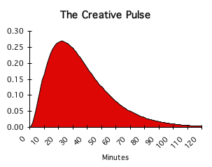
If we plot the derivatives (the trajectories) of a series of moments, we can produce a graph. For instance, the Pulse of Attention is the graphic visualization of the 2nd derivative of a data stream consisting solely of 1’s. Graphic visualizations of the Living Algorithm’s digestive process are the substance of the Project. In other words, this is the process by which our mathematical models are generated.
The Project: when the Living Algorithm digests binary data streams
The Living Algorithm can digest a data stream consisting of any string of numbers. In the search for the essentials of this process, we simplified the numerical values of our data to 1 or 0 – a binary data stream. The Living Algorithm Project is the name we gave to an exploration of the Living Algorithm’s process of digesting these binary data streams.
Living Algorithm Behavior & Human Behavior
The Pulse of Attention
One set of computer experiments investigates the behavior of the Pulse of Attention
Now we can tackle the 2nd question. What does it mean for a graph to behave? The methodology of this project is as follows. The Author set up a computer program that implements the Living Algorithm’s method of digesting a data stream. When the Living Algorithm digests a data stream consisting solely of 1s, one result is the Pulse of Attention, a.k.a. the Creative Pulse. Due to the pure simplicity of the data stream, we refer to the Pulse of Attention as the Living Algorithm’s most basic transformation. One set of computer experiments explored what happens when we manipulate the data stream that produces the ideal Attention Pulse. Specifically, we introduced 0s at various points in the data stream and investigated what happens to the ideal pulse. Because only variations to the Pulse of Attention are considered, we refer to this as the behavior of the Pulse of Attention.
Another set explores behavior of Triple Pulse
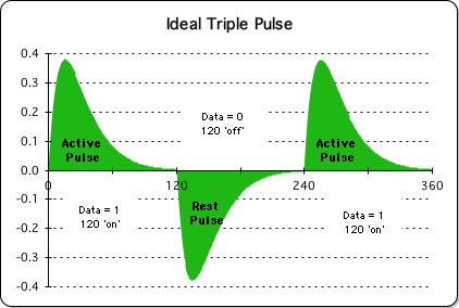
The second set of experiments explored what happens when we manipulate the data stream that produces the ideal Triple Pulse. Mathematically speaking, the Triple Pulse is an alternation of positive and negative pulses – the Active and Rest Pulses at right. This graph is the result when the Living Algorithm digests a specific data stream consisting of a string of 1s, then a string of 0s, and then another string of 1s. Due to the purity of the data stream’s pattern, we refer to the Triple Pulse as another of the Living Algorithm’s basic transformations. As we observed in a previous article, the Triple Pulse experiment builds upon the initial findings of the Creative Pulse Experiment by exploring the cyclical relationship between these pulses. Due to their binary simplicity, the Pulse of Attention and the Triple Pulse are the most basic Living Algorithm transformations.
The Project: Manipulations of Ideal Graphs
Both sets of these computer experiments produce a series of graphs. These graphs are a visual representation of the modifications of the ideal pulse that result from the experimental manipulation of the data stream. In essence, a basic equation yields a simple computer program that produces a variety of graphs that pertain to the Pulse of Attention and its cyclical extension, the Triple Pulse. In other words, when we speak about the Living Algorithm’s behavior, we are referring to the behavior of the Pulse of Attention and the Triple Pulse when the data streams that generate the ideal graphs are manipulated.
Determining Human Behavior
We can now address the 3rd question: How is human behavior determined? We establish the validity of human behavior in 3 ways as a form of cross-checking: personal experience, prevalent social convention, and experimental confirmation. To separate behavioral fact from fiction, we appeal to personal experience; we point to prevalent social convention; and we cite current experimental findings.
The Power of Visualization
We understand how the mathematical models are generated; how graphs behave, and how we determine human behavior. Now we come to the trickiest question. How do we establish the correspondences between the behavior of our graphs and human behavior? The answer is simple: Visual analysis. However, justifying this approach will take the rest of the article.
Visualization of Data essential for Understanding
There is a fundamental feature to the methodology of the Living Algorithm Project that some might find unusual. Both 'experiments' that comprise the project are based upon graphs derived from the mathematics of the Living Algorithm. When we examine these graphs, intricate patterns emerge that are both aesthetically pleasing and visually informative. This methodology with its graphic emphasis subordinates numbers and equations in favor of the pragmatic significance of the pictorial content. This visual approach is a relatively recent methodological tool of modern science, and, in our case, represents the heart of our endeavor to interpret the patterns of data streams.
Pulse of Attention Data vs. Graph
The visualization of the data as a graph is an essential analytic tool. The validity of this statement is obvious when we put the data and the graph side-by-side. Pictured is just a small fraction of the data that is required to create the picture (a graphic representation) of the same data.
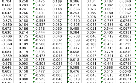

The numbers represented above are basically gibberish, even to a trained observer. In contrast, the picture instantaneously reveals a distinct pattern to even the most casual observer. In this context, the expression 'seeing is believing' morphs into 'seeing is understanding'.
Computer Visualization Mainstream Science
It is important to note that this mode of analysis is not an unusual methodology any longer. It is part and parcel of the computer revolution. The computer is able to generate enormous amounts of data. For any human, or any collection of humans, to comprehend the patterns behind this profusion of numbers seems daunting, if not impossible. Therefore, many scientists employ data visualization as an analytic tool to interpret the abundance of data produced by the computer age.
Mandelbrot's Fractal Geometry based in Computer Computation and Visualization
Perhaps the most celebrated case of visualization as an analytic tool is Mandelbrot's development of fractal geometry. The elaborate and complex computations behind his simple self-referential equations would not be humanly possible. An analysis of the numerical data, no matter how meticulously done, would never have revealed the intricate fractal patterns that occur on finer and finer levels of magnification. Mandelbrot required a computer to first perform the mathematical computations and then visualize the resulting data. This process revealed unsuspected patterns that would not have been detected by the exclusively numerical eye.
JPL's Space Program employs a graphic visualizer
On a more immediate and personal level, the Author has a friend who works for the prestigious Jet Propulsion Lab, which is associated with the space program and Cal Tech. One of his jobs was to create animated visualizations of the data generated by spacecraft. The spacecraft utilized sensors to gather data from remote locations, such as the surface of Venus. The crunching of this new computerized data enabled scientists from a variety of disciplines to visually analyze the planetary landscape. This visual methodology revealed ridges and valleys in the physical geography of the planets, which might never have been revealed by the raw numerical data. Scientists at the end of the 20th century employ these graphic visualizations as a modern methodology to analyze distinct features of our solar system.
Computer data generation and visualization essential for Living Algorithm Project
The two examples discussed above illustrate that the computer age enables us to broaden our methodological approach to analyzing data. The computer enables us to run experiments that involve computing enormous amounts of data. It also enables us to visually represent the patterns that result from these computations. Both of these aspects of the computer age are central to the methodology featured in the Living Algorithm Project. Not only does our project require the computational power of the computer, but we also found that the visualization aspect was crucial to the identification and analysis of patterns. As such, this entire study would have been impossible before the computer age.
Visual nature of Project’s Methodology increases accessibility
Besides the functional roots, the visual nature of the study has another major advantage – accessibility. The visualization of the data enables the Viewer to recognize patterns and draw his or her own conclusions. While equations and derivations are only accessible to experts, the elegant simplicity of the graphs in this study is accessible to everyone, even children. In essence, the visual nature of the graphs is the essence of the technology's utility – rendering it intelligible to a broad audience. This is a unique advantage to the visual means of communication.
Visual Processing is the best way to comprehend data.
We will even suggest that visual processing may be the best way to comprehend the patterns of the data, due to the incredible analytical power of our visual system.
"Sophisticated vision requires enormous computing power – and more. A big brain is not enough; vision requires processing methods so clever that nobody as yet has any idea how the brain does the job. …Our own visual system can identify an object at different distances, when partially concealed by others, and from unfamiliar viewpoints. It attaches labels to features of our surroundings, which persuade us that we see full color, three dimensions, and "real-time" motion. Compared to this the biggest supercomputer is no more than an abacus." (The Collapse of Chaos, Cohen and Stuart, 1994, p. 467)
It appears that the visual organization of information taps into the mind’s ability to leap toward pattern recognition.
Could Graphic Visualizations access Subconscious Power?
Subconscious perceives Pattern; Intellect verbalizes it
In his book the Act of Creation, Arthur Koestler characterizes this leap toward pattern recognition as the Eureka experience. He argues that the ‘Eureka experience’ (often referred to as the ‘Aha moment’) precedes verbal analysis and flows from an intuitive response to subconscious processes.
Example: Mathematicians & Physicists
Koestler presents a compelling example in support of his claim. He notes that studies examining the most abstract of scientific thinkers, mathematicians and physicists, have illustrated that the verbal or logical level follows from an initial insight derived from a sensory experience. The insight comes all of a sudden, perhaps in sickness, dreaming, waking or walking. It is at this point that the intellect takes over – translating the inspiration into abstractions, such as ideas, equations, or music.
Subconscious communicates to Consciousness via Visions
Often these moments of inspiration take the form of visions, whether waking or dreaming. Koestler cites a number of individual cases where a visual experience stimulated powerful insights into the patterns of the natural world. As examples: Faraday (magnetic fields), Tesla (alternating electric current), Kekulé (carbon-based chemistry) and even Einstein, all reported visual experiences that led directly to their new-found conclusions.
Visualization precedes Conceptualization
The scientist or mathematician can literally see the pattern taking shape. Rarely are these visions communicated in logical dialogues. The response to these visions is typically intuitive. The verbal logic that articulates the insight follows from the initial, typically visual, experience. Koestler argues that visualization is a method by which the subconscious recognizes and communicates patterns to the conscious. In essence, the Eureka moment is when the conscious mind grasps the underlying pattern revealed by subconscious processes. Koestler concludes that:
“Visual images and symbols are not fanciful embroideries of concepts, but precursors of conceptual thought.” (The Act of Creation, p. 325)
The eyes open and we begin to wonder what we see. In our quest to begin making sense of our world, what we see fundamentally shapes the nature of our thinking.
Examples where visual understanding precedes abstraction: 1) Evolution
Koestler provides additional examples in support of his claim that sight precedes thought in the process of pattern detection and articulation. For instance, verbalization arrives very late in the biological evolutionary process. Biological systems developed the ability to visually perceive events many millions of years before the advent of human beings. In addition, evidence regarding the evolution of human language suggests that simple languages typically employ visual images and few, if any, abstractions.
2) Language acquisition
Another example emerges from a consideration of language acquisition by young children. The pattern of early language usage reveals that children typically begin the speaking process by verbalizing significant elements of their visual field of experience. In essence, they speak about what they see. The ability to form world-organizing abstractions via generalizations occurs in a later stage of child development.
Einstein's summary: Verbalization a secondary stage
Let's summarize our analysis with a quote from the esteemed Albert Einstein. In response to a query regarding his methodology, he wrote:
"The words or the language, as they are written or spoken, do not seem to play any role in my mechanism of thought. The physical entities which seem to serve as elements in thought are certain signs and more or less clear images which can be 'voluntarily' reproduced and combined. … This combinatory play seems to be the essential feature of productive thought – before there is any connection with logical construction in words or other kinds of signs which can be communicated to others. The above mentioned entities are, in any case, of visual and some of muscular type. Conventional words or other signs have to be sought for laboriously only in a secondary stage, when the mentioned associative play is sufficiently established and can be reproduced at will." (The Act of Creation, p 171)
The examples we have cited suggest that one function of our subconscious processes is the ability to perceive patterns, while one function of our intellectual processes is the subsequent verbalization of perceived patterns.

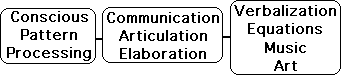
Project Methodology taps into Subconscious’ Powerful Pattern Recognizing Ability
Accordingly, our methodology’s reliance on graphic visualization as a form of analysis is actually an asset. By immediately engaging our subconscious digestive process, visualization initiates and provides a fundamental foundation for verbal articulation of understanding. This could be why many who view the Creative Pulse graphs have an immediate gut reaction. The subconscious appears to instantly perceive patterns of correspondence between the behavior of the graphs and significant elements of their own experience. The power of graphic representation is that it reaches a particularly broad audience. Its visual nature is immediately accessible and taps into our powerful subconscious ability to recognize patterns.
Current task: Translating Subconscious Insight into Conscious Understanding
Author's personal experience with translating Insight into Understanding
The laborious secondary stage that Einstein refers to requires conscious articulation of the initial insights that were generated subconsciously. This is the challenge confronting the Author as he contemplates the meaning and significance of the Living Algorithm. Starting in 1978, the Author has had a series of insights associated with the Living Algorithm. His subconscious processes led to insights into the patterns of correspondence between human behavior and graphic behavior. Although the insights were relatively instantaneous, translating the information into intelligible form has been a challenging task that has preoccupied him periodically for decades. In fact, it is taking his entire lifetime (currently 2013) to communicate these ongoing revelations. Translating subconscious insight into conscious understanding is the daunting stage where we are presently in the communication process with our readers.
Visual Information requires language for transmission to a wider audience
Words are the chosen vehicle for analyzing and transmitting this rich visual information to others. A verbal explanation of the methodology behind the experiments is a necessary step in making the graphic information useful to the reader. The simple, yet intricate, almost organic beauty of the graphs speaks to us on an intuitive level. Our current challenge is to translate our intuitive response into a verbal description that creates a context for interpretation. A working understanding of the graphs requires readers to know how these graphs were generated and what they represent. Communicating this understanding of our visual approach is the task of the next article in the series series – The Pulse of Attention Interrupted.
If the Author's path of discovery is of interest, check out 'Providence guides the Investigation'.
Or maybe you’re ready for a shift from Left Brain discourse to Right Brain metaphor. If so, shift back to our parallel universe and read Life ready to see the Living Algorithm in action.